Графики, диаграммы и таблицы содержат большое количество информации, представленной в доступном и легко понимаемом виде. Когда вы работаете с графиком или диаграммой, важно понять ее цель, т.е. каким образом подана информация, и что именно она показывает: частоту выполнения действий, процентное соотношение долей, делит что-либо на категории, показывает ли темп роста и т.д. Существует множество видов диаграм, но наиболее употребимые из них это:
- столбиковая диаграмма (bar graph),
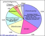
- секторная (pie chart),
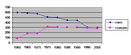
- линейная (line graph).
На рисунках ниже видна графическая разница между ними. Все графики или диаграммы, в каком бы виде они не были представлены, отображают информацию последовательно, значит, главная задача при их описании - найти так называемый старт, в ходе чего следуя алгоритму, который приведен ниже, вы сможете описать график.
bar chart
pie chart
line graph
Алгоритм описания графика (диаграммы, таблицы)
1. Внимательно прочтите задание и изучите график (диаграмму, таблицу), сконцентрируйтесь на фактах. Выберите, какая информация является важной, а какую можно и опустить.
2. Составьте примерный план, в котором будет введение, основная часть и заключение. Причем, вступление и заключение – это всего два предложения: вводное предложение, как правило, описывающее, что изображено на графике (таблице, диаграмме), и одно заключительное предложение – вывод:
The graph (diagram) shows the rate of smoking people in …
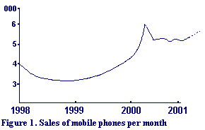
Figure 1 shows sales of mobile phones per month.
This table illustrates clearly the extent to which the flora of selected islands now contain alien species, with the percentage varying between about one-quarter and two-thirds of the total number of species present.
The table gives an example of an engineering curriculum.
3. В подобного рода заданиях от вас не требуется высказывания своего мнения, таким образом нельзя употреблять слова «я думаю», «мне кажется». Также не стоит оценивать информацию, плохо это или хорошо с вашей точки зрения, не нужно объяснять возможные причины роста или падения, это лишнее. Используйте более официальный стиль.
4. Не отвлекайтесь на детали, не уходите в описание подробностей. Нельзя разрозненно говорить о данных графика, диаграммы, то есть, терять главную мысль. Не описывайте каждый пункт на графике отдельно (например, какие данные были в каждом году), а делайте обобщения, отмечайте тенденции, взлеты/падения и т.д.
5. Подбирайте синонимы к словам, не используйте одинаковые грамматические конструкции.
6. Дополнительная справочная информация и примеры описания графиков, таблиц и схем:
goodluckielts.com — ключевые слова при описании схем; ielts.scool.nz — распространенные словечки в тестах IELTS; world-english.org — хорошие образцы описания графиков и диаграмм;
examenglish.com – образец описания круговой диаграммы
ielts-exam.net – образец описания линейного графика
docstoc.com – примеры описания диаграмм и графиков
scribd.com – большой сборник описаний диаграмм и графиков
cstl.syr.edu – хорошая книга о всех видах диаграмм, графиков и таблиц на английском языке с иллюстрациями, упражнениями и ответами.
admc.hct.ac.ae – про все виды графиков и диаграмм.
adw.hct.ac.ae и admc.hct.ac.ae — описание графиков на английском и «demand curve», кривых спроса;
eslflow.com — упражнения и описания графиков на английском для IELTS теста;
Речевые модели, употребляемые при описании графиков (таблиц, диаграмм):
Слова и выражения, употребляемые при описании направлений:
Направление
глаголы
существительные
Rise (to)
Increase (to)
Climb (to)
Boom
Go up (to)
Grow (to|)
Peak (at)
A rise
An increase
A climb, growth
An upward
trend
A boom (a dramatic rise)
(reach) a peak (at)
Fall (to)
Decline (to)
Decrease (to)
Dip (to)
Drop (to)
go down (to)
Slump(to)
Reduce (to)
A decrease
A decline
A fall
A drop
A slump (a
dramatic fall)
A reduction
Level out (at)
Did not change
Remain stable (at)
Remain steady (at)
Stay constant (at)
Maintain the same level
A levelling out
No change
Fluctuated (around)
Peaked (at)
Plateaued (at)
Stood at (we use this phrase to focus on a particular point,
before we mention the
movement, for example:
In the first year, unemployment
stood at … )
A fluctuation
Reached a
peak (of)
Reached at
plateau (at)
Слова, характеризующие степень изменения направления
just under, just over
well under, well over
roughly, nearly
approximately, around
about
Примеры:
Figure 1 shows sales of mobile phones per month. As can be seen, it covers the years 1998 to 2001 and shows that the sales of mobile phones declined steadily in 1998, then remained steady from May until the end of the year. The sales rose more and more steeply, throughout 1999, with a steep increase at the end of the year, and reached a peak of 6,200 in February 2000. A sharp fall followed but sales levelled off at about 5,300 per month in April, fluctuated slightly through the year, and are now increasing again. The figures seem to indicate that we have recovered from the problems in mid-2000 and are on target to improve on our February 2000 peak by the end of 2002.
The graph shows the rate of smoking in Someland. In 1960, 600 men in every 1,000 were smoking. This number decreased gradually to 500 by 1974 and continued to decrease but more steeply to 300 in 1995. In contrast the rate of women smokers in 1960 was very low at only 80 in every 1,000. This number increased to 170 by 1968 and increased again but more steeply to 320 in 1977. The rate of female smokers then remained stable at 320 until 1984 at which point the figures began to decline and had dropped to 250 by 1995.
Proportion of students
The chart shows the grades obtained by students in a class. Overall almost 90% of the students passed. More than half of the students obtained a very good grade, with 21% getting a distinction and 33% getting a merit grade. Only 8 % of the students failed.
Uses of Apples USA
The graph compares the chief uses of the apple crop in the US. Overall, the bulk of the harvest is either eaten fresh or made into juice. The biggest slice of the pie-chart is taken up by fresh fruit. About 60% of the crop is eaten fresh. This is three times as much as the next use, which is for juice. Less than 20% of apples in the US are turned into apple juice. A further 12% is canned and a total of 5% is either frozen or dried. Other remaining uses such as apple vinegar, account for just 5% of the crop.
Table 4.2 Typical Freshman Engineering Curriculum
Semester Hours Credit
Freshman Year Courses
1st Semester
2nd Semester
CHEM 101 - General Chemistry
-
CHEM 102 - General Chemistry
-
MATH 120 - Calculus and Analytical Geometry
-
MATH 132 - Calculus and Analytical Geometry
-
Elective in Social Science or Humanities
GE 103 - Engineering Graphics
-
RHET 105 - Principles of Composition
-
ENG 100 - Engineering Lecture
-
CE 195 - Introduction to Engineering
-
PHYSICS 106 - General Physics (Mechanics)
-
TOTALS
Table 4.2 gives an example of an engineering curriculum. Such a curriculum does not tend to vary significantly among colleges and universities or engineering disciplines. Note that the curriculum described adheres to the requirements of ABET. That curriculum is based on the semester system. Many universities operate on the quarter system in which the academic year is divided into three periods of about 12 weeks duration. A quarter-based-curriculum would of course be "packaged" differently but would be similar to one based on the semester system.
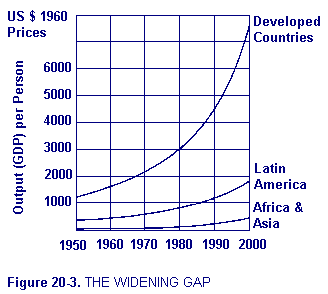
About 70 percent of the world's population lives in the less developed countries. What is more noteworthy about this situation is that the rate of economic growth of the developed countries exceeds the rate of economic growth of the underdeveloped countries, creating an ever-widening gap between the richest and poorest nations, as can be seen from the graph in Figure 20-3. Especially alarming in this regard is the fact that during the decade 1960-1970 agricultural output in the underdeveloped countries increased at an average annual rate of 2.7 percent per year while the population of these countries increased at an annual average rate of 2.8 percent (United Nations 1973), creating an absolute deterioration in their living standards.
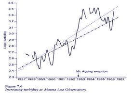
Figure 7.6 shows that the average turbidity factor for the atmosphere (Linke turbidity) has increased by 30 per cent in a decade (the dot-and-dash line). It also shows the effect of a natural source of turbidity, the Mount Agung (Bali) eruption of 1963 (the single, continuous line). In the figure the dotted line represents the linear trend for the same period if the effects of the eruption are excluded from the computations.
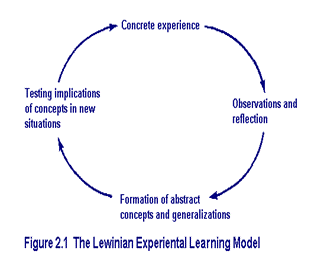
In the techniques of action research and the laboratory method, learning, change, and growth are seen to be facilitated best by an integrated process that begins with here-and-now experience followed by collection of data and observations about that experience. The data are then analyzed and the conclusions of this analysis are fed back to the actors in the experience for their use in the modification of their behavior and choice of new experiences. Learning is thus conceived as a four-stage cycle, as shown in Figure 2.1. Immediate concrete experience is the basis for observation and reflection. These observations are assimilated into a "theory" from which new implications for action can be deduced. These implications or hypotheses then serve as guides in acting to create new experiences.
Описание графиков, диаграмм и таблиц (2)
Речевые модели, употребляемые при описании графиков (таблиц, диаграмм)


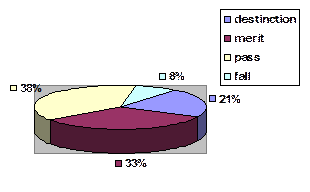 Proportion of students
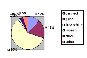 Uses of Apples USA